NET Single-Column Reference Edition
A review of not one, but two editions of this midsize single column Bible from Thomas Nelson.
A lot of people reached out to me last month after my review of the NET Full Notes Edition, a very unique Bible that includes over 60,000 notes from the team of translators that worked on the NET. Almost everyone who sent me a note or left a comment agreed that it was a cool idea to include all those translator notes, but a few of you also asked if there were “regular” editions of the NET to check out.
The answer is YES.
In addition to the Full Notes Edition, Thomas Nelson also offers the NET in a Large Print Thinline Edition and a Journal Edition. And earlier this year they unveiled a brand new NET Single-Column Reference Edition.
As a fan of single column Bibles, I decided to see what this latest NET text block has to offer.
NET Single-Column Reference Edition – Overview
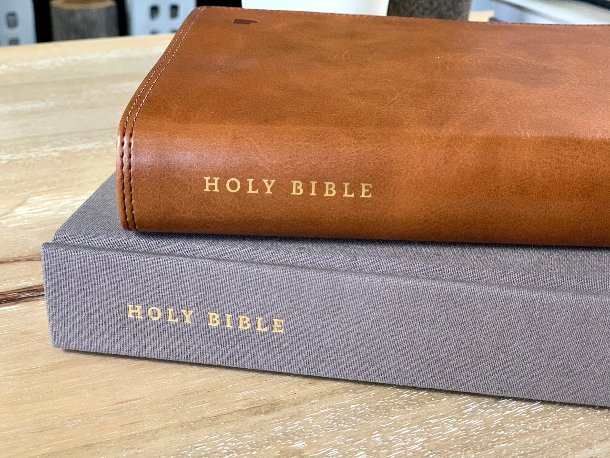
All of the NET Bibles from Thomas Nelson come in several different binding options. As you can see from my photos, I have one copy of the NET Single-Column Reference Edition in gray cloth-over-board, and another in brown leathersoft (it’s also available in teal and black leathersoft editions). Other than the covers, the only differences between the two are that the leathersoft edition has rounded page corners and gold art gilding on the page edges, whereas the cloth-over-board edition has square corners and no gilding.
Thomas Nelson has yet to produce a premium NET Bible, which they call the “Premier Collection.” I’d love to see this Bible in a binding similar to the brown goatskin of the NKJV Single-Column Reference Edition that I raved about earlier this year, but I’m not sure if the NET is a popular enough translation for Thomas Nelson to justify a more expensive option.
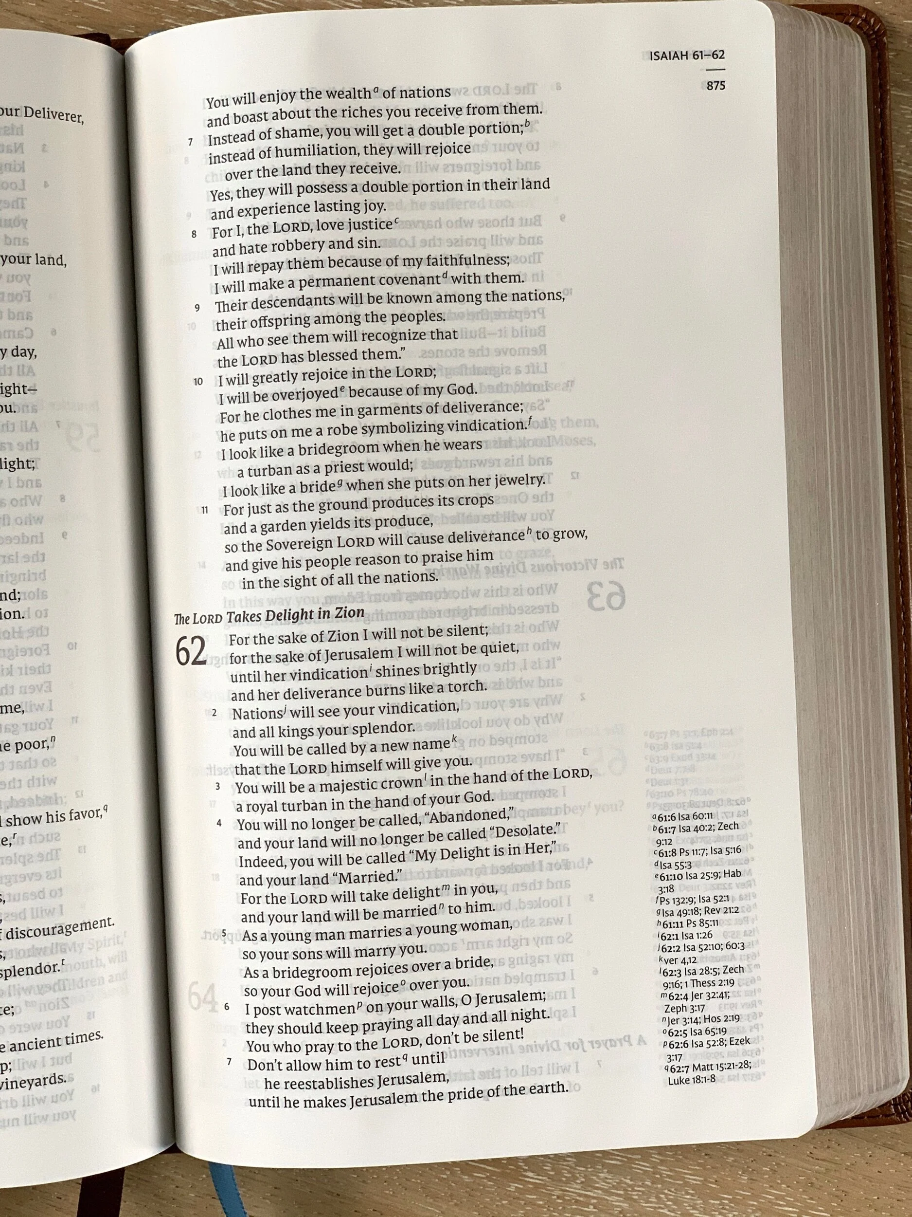
The NET SCR is a slim, midsize bible with a 5.25” x 8.25” trim size. The leathersoft edition is 1.25” thick, and the cloth-over-board is just a hair thicker. The font size of the main text is an 8pt custom NET Typeface from 2K/Denmark. It’s a tad small for me, but still very readable. I think this might be my favorite of all the custom typefaces that 2K/Denmark has designed for Thomas Nelson and Zondervan.
The cross-references in the NET Single-Column Reference Edition are found on the outside of each page, justified to the bottom of the page. This feels like a “there when you need them, out of the way when you don’t” situation. The Bible also includes a concordance and a set of maps.
FEATURES
• 8pt type size
• 5.25” x 8.25” trim size
• 1.25” thick
• Single-column text with line matching
• custom NET Typeface from 2K/Denmark
• Smyth-sewn binding
• Two ribbon markers
• Cross-references
• Concordance
• Maps
Notes or Not?
I like the NET translation, but I think the thing that makes it special is the translators’ notes. As someone who loves to study the Bible, I’m fascinated by the work scholars do to translate the original Hebrew, Greek, and Aramaic texts into English, and the NET translators’ notes allow me to engage with their work as I’m reading and studying the text. The publishers promote this as a level of transparency, but the idea of giving readers the best of both worlds when it comes to formal vs. functional equivalence only really works for the NET when the notes are being used.
Thankfully, the translator notes are available online. So instead of carrying around the massive Full Notes Edition, you can pick up a copy of this Single-Column Reference Edition and access the notes from your phone or computer.
For those of you who haven’t read my previous review of the NET Full Notes Edition, here’s the basic recap:
the NET is a completely new translation of the Bible from the original languages done by a team of over 25 scholars
the First Edition was released in 2006 (two previous “Beta” editions), most recently updated in 2019
it was commissioned by the team at www.Bible.org as a translation that could be downloaded for free online
it includes over 60,000 notes from the translation team that documents their decisions
A Solid Way to Access the NET
The more I think about it, the more I like this Bible. No matter what binding you choose, each one looks great (I love the look and feel of both of these editions I have). They’re also made well, and they’re affordable. And with access to the NET translators’ notes online, this Bible offers you a great way to engage with the NET translation in a modern way.
Bottom line:
If you’re curious about the NET translation and want a solid yet inexpensive Bible to use as you check it out, this NET Single-Column Reference Bible is a great option to consider.
BUYING THIS BIBLE*
• Amazon:
*Pricing and Availability subject to change.
About Tim Wildsmith: “I’m a pastor, writer, and musician from Nashville, where I live with my wife, Becca. I have always loved a Bible that is beautifully designed, well-crafted, and practical, and I’m convinced that finding a Bible you love and enjoy reading will make you want to spend more time with it.” Click here to read the full bio.


